There's definitely an overflow of artwork for children in Australia.
But the local quality of both the designs, and printed materials, for little boys' rooms is mostly subpar.
And if it's great, it's often heftily priced.
There's also an abundance of blockbuster characters and Hollywood heavyweights.
But a shortage of well designed artwork with heart-warming, nature-loving, kindness-promoting undertones.
And that's where One Tiny Tribe fit in.
Design-conscious parents want to create environments for their children that do 2 things:
- Give their kids the inspiration to learn, explore, grow, and develop.
- But they also want spaces that fit into the rest of their purposefully crafted decor.
So when we launched One Tiny Tribe, our primary aim was to cater to this desire for top-quality, skillfully-designed, affordable kids' prints.
Our very first collection was almost completely themed for little boys' rooms.
And while we've added some girly prints and several 'adult' options, too - our brand's calling is grounded in serving our primary audience: mums with little boys.
Through countless surveys and various channels of communication with our customers and our community, we've confirmed that One Tiny Tribe is exceptionally good at creating:
Top-quality, feel-good art work for little boys, that satisfies their design-conscious mums.
This positioning is something our team is strongly aligned around and it's had a significant impact on our new identity system.
Which is why now is the perfect time for a brand refresh!
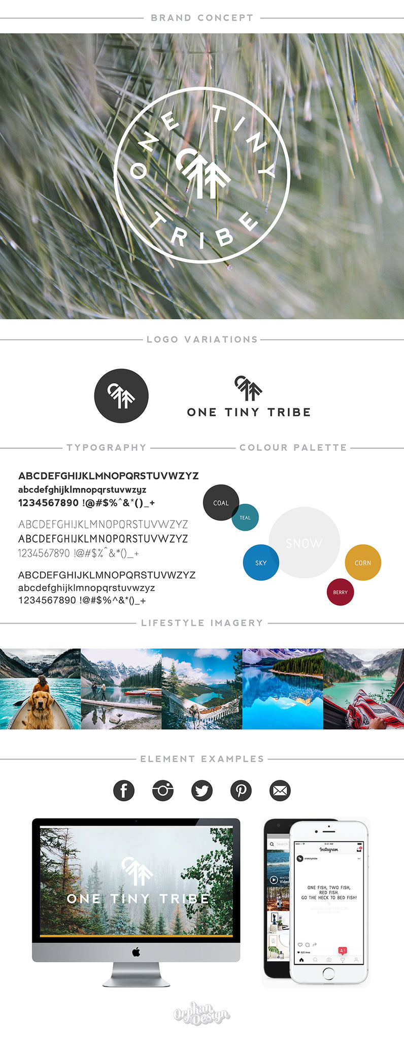
The Logo
If you've caught the entrepreneurial bug, you know the crazy desire to just "get shit done".
Even if you're a perfectionist at heart, all the fancy shamcy takes a backseat to just getting your idea off the ground.
When we started One Tiny Tribe, we had that exact mantra - get it out there and then refine.
So we poured all our efforts into perfecting our products.
And our logo didn't even make top five on the priority list.
Smooshed together in a hurried effort to launch, the logo didn't really do our vision justice. But it was good enough to get the ball rolling.
Don't get us wrong, it served us well. The connection of the three little feathers that represented each word of our brand name was there.
But that vague concept doesn't paint a clear picture of our brand.
Luckily, this time we worked with a seasoned brand builder who really took the time to understand One Tiny Tribe at its core.
Krystal Gough, of Orphan Design, collaborated with us every step of the way.
She wisely guided the aesthetic of our feelings, vibes, and emotions about our brand.
Krystal understood from the get-go that we needed something more time-proof that wouldn't date as easily as the original design.
She also accepted our challenge to create a clever element that reflects the unique and skillfully design nature of our products.
And in the end, her deep understanding of what we're all about, allowed her to capture the lifeblood of our feel-good, outdoor-exploring, heart-felt, adventure-filled, steadily-growing brand.
The final result took our breath away.
The sturdy pines, representing the ever-green nature of our brand, stand strong and point upward to the sky - always growing and improving.
And the intelligent placement of the sun/moon overlooking the pines builds a very savvy - yet subtle - combination of the letters "OTT".
Three variations of the logo add flexibility to implementation and we've achieved the sophisticated upgrade we were after.
This is logo design at its finest.
![]()
The Type
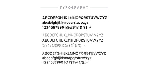
During this brand refresh we were thrilled to get a chance to cleanse and tighten up our typography too.
We've gone from using 7 different font families (wtf were we thinking?!) to just 3.
The most obvious elements we've refined are our logo type and our Instagram quotes type.
The logo type was a no-brainer since we needed something clean and practical that would support our new logo element.
But finding the right font for our Insta quotes wasn't as easy.
We originally used a character-filled font that innately formed the parent/child connection for our mostly parenting-related funnies.
However, we knew our brand had outgrown that.
So we decided on a more polished, yet still-a-bit-whimsical, font with a hand-written element.
We feel the new font creates a smoother connection with our community, while still adding the character One Tiny Tribe is known for.
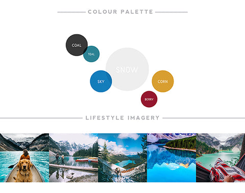
The Palette
Charcoal is the new black!
...at least for us.
Monochrome has served us well. So we didn't want the overall look to stray too far from it.
However, we wanted to find a more sophisticated substitute to the sharp contrast of black and white.
So we adopted charcoal - a softer alternative to black, that's easier on the eye, both online and off.
And with our products heading in a more colour-filled direction, we felt it was time to add some more hues to our branding too.
With our brand fibers rooted in forest (no pun intended) and mountain range environments - this is where we looked for the perfect palette.
And our new brand highlights - teal, sky, snow, corn, and berry - have naturally emerged from the scenic backdrops of pines and snow-capped peaks.
Where To From Here?
We've got many exciting things planned over the coming months.But first thing's first and that's the fact that our team remains the same.
As does the majority of our artwork.
We'll be phasing out some of our girly designs over the next few weeks (yay - sale!).
However, the prints you've come to adore and recognise us for will still be right here waiting for you when you're ready to snap them up.
Aaaaand we'll be adding in a bunch of new designs we've been eager to share with you.
If you've shopped with us before, or you've signed up to our Museletter mailing list, keep an eye out for some sneak peaks and early bird specials.
It's an exciting time here at One Tiny Tribe HQ and we're so stoked you're on this journey with us.
You're support is endlessly appreciated.
xx One Tiny Tribe
2 comments
I love the new branding, so clean and the logo is just perfect. I cannot wait to see your brand push forwards.
Mr Adam Robertson
It must be so satisfying and cleansing in the mind to be able to move forward with new branding and new vision. Well done. All the best!
And also well done on recognising the need that print sizes need to change, great idea. So for all the country folk that may never get to an IKEA, they can still buy their frames at Spotlight and other smaller stores, even Kmart! Yay!
????